17 Best Abandoned Cart Email Examples to Win Back Customers

Table of Contents
Let’s not deny the fact that most of us use online platforms to order the products we need. After all, it has become so easy to find the right product for our needs, and that too without stepping a foot out of our homes.
However, there are multiple instances where we browse items on an e-commerce store and add them to our carts but leave without completing the checkout process.
Why? Well, there are numerous reasons for that. For example, you were simply checking out the product, something else came up that made you skip the payment, or anything else that got your attention.
But if you are a business owner running an e-commerce store, losing these sales-qualified leads is not a good thing for your revenue. That is why, it is important to send abandoned cart emails to transform your prospective buyers into actual customers.
Having said that, you have to ensure that your emails are compelling enough to drive your users to come back and complete their purchase. So, to inspire you, I have curated a list of 17 best abandoned cart email examples from real-life brands. Let’s explore!
17 best abandoned cart email examples to get more sales
A well-structured abandoned cart email allows you to encourage prospects who are interested in your offerings to return and finish placing the order for the items in their carts.
With that said, let’s see how successful brands send these abandoned cart emails to drive users back to their sites to get sales that might have been lost otherwise.
Peel
Peel is an online mobile phone accessory store, and in its abandoned cart email, it starts with a free shipping offer followed by a confrontational catch line “Still Thinking it Over?”. Below the heading comes the description compelling the readers to take action today.
Then comes the in-detail description of your cart, including all the necessary details like product name, quantity, and price. Right below that is the bright, hard-to-miss CTA.
All in all, the email was well-structured, provided important information up-front, and ended up with any questions or comments you might have.

Alex Mill
Alex Mill, an online apparel store, starts its abandoned email with the most important aspect, price. After all, having to pay more than they anticipated is also a reason why prospects leave before completing the purchase.
For this reason, Alex Mill’s abandoned cart email heading conveys clear meaning with “Get Them for 15% Off.” Right under the heading, there is a CTA to take you right to your cart and view your total with 15% off.
The email then dives into your cart items but instead of showing you the name of the product, it showcases the actual images of the products, encouraging you to get them as soon as possible.

Timberland
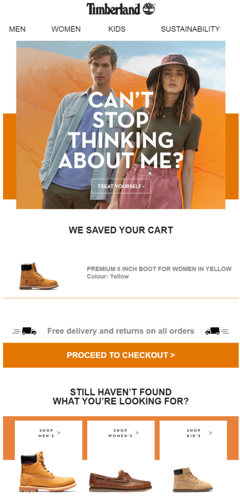
Timberland’s abandoned cart email reminds the readers about the items they left in their cart. The text, "Can't stop thinking about me?" builds a feeling of familiarity and encourages its audience to finish placing their orders.
The email also talks about free delivery and returns. The line, "Free delivery and returns on all orders" eliminates any objections that a customer might have regarding shipping charges.
Furthermore, Timberland uses its cart abandonment emails to boost sales engagement by offering its users a chance to keep browsing. It suggests shoes for men, women, and kids, which gives the customer the opportunity to look at other products for their friends and family.
Dyson
Dyson is an electronic and home appliance brand, that in its cart abandonment email, had a funny take on words with the phrase “All is not lost”. Additionally, to complement the headline, the description also mentions “saving the content” of your cart.
On top of that, Dyson added a full-size picture of the product and included the cart details to inform you about the items. Plus, to urge the readers to take action, the line, “offer is only for a limited time” is included in the email copy.
Finally, there are two bright green CTA buttons to ensure you know how to move on to the checkout step no matter where you are in the email.

Ready to Boost Your Conversion Rates?
Make use of Zixflow, a powerful multi-channel marketing platform to send abandoned cart emails to reclaim lost sales
Book a DemoNomad
The abandoned cart email from Nomad is also an excellent example of how to structure your email and not be afraid to use bold language that fits your brand. The heading starts with the clear “What Happened?” with mountain tops, showcasing its fearless brand image.
Furthermore, the email copy uses cheerful language that adds a feeling of familiarity to the email. For example, the text, “Did your Wi-Fi crash?” is a great one-liner because it is usual to lose Wi-Fi coverage at high altitudes.
The email then mentions the product in the cart via an image but doesn’t tell any information about it, sticking to that minimalistic feel. Lastly, to reassure buyers that they can return/ exchange products within 30 days and a two-year limited warranty.

Google Store
Google Store with its simple and to-the-point cast abandoned email, used direct sentences to convey its message. The subject text, "Going, going, almost gone" effectively highlights the scarcity of the products in the cart. This urgency can motivate the prospects to complete their purchase before the items sell out.
Right below that, Google showcased a clear image of the item left in the cart. Additionally, it displays the quantity and price to jot up customer’s memory as to what they were thinking of getting.
Furthermore, the email includes links to customer support chat and request a call, providing the customer with multiple ways to get in touch if they have any questions about their purchase. Also, Google has used this email as an opportunity to convince customers to subscribe to its e-commerce email marketing list, further boosting its sales efficiency.

Whiskey Loot
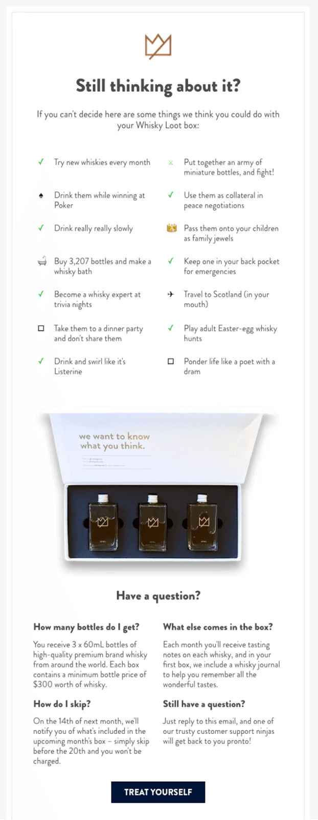
Whiskey Loot, in its relatively long abandoned cart email, highlights different benefits its customers can enjoy with its Whisky Loot box. The subject line, "Still thinking about it?" is great at making the prospects think about finishing the checkout process.
Whiskey Loot has adopted a customer-centric selling technique and uses humor throughout the email to keep the tone light and engaging. It lists numerous literal and figurative benefits of getting a “Whisky Loot box" to its customers toward completing their purchase.
Lastly, the email includes answers to common questions a prospective customer might have about the product. This way, they are resolving any potential queries that may stop its customers from making a purchase.
Massdrop
Massdrop uses a simplistic email layout, where the content is followed by a product showcase and the email ends with suggestions about similar products to increase the chances of getting a sale.
It uses a plain email copy with everyday words to not overwhelm the reader. Instead, the brand highlights key information in the content, such as a link embedded within the content and the bolded “ends in 19 days” text.
At the end of the email, Massdrop has added some relevant products for cross-selling and up-selling purposes. This way, it can make the reader go back to its site to browse similar items, increasing the chances of getting the purchase.

Allbirds
Allbirds uses a straightforward subject line, "Don't get cold feet," which is catchy and directly relates to the brand that sells shoes known for their comfort. It also uses a touch of humor to grab the reader’s attention.
Adding on to that, the email uses the phrase “Limited Edition colors and new products go quick,” to create a sense of urgency. It also subtly implies that the shoes in the cart are loved by many.
Reading on through the email, it features a clear image of the item and its name. The email has a clear CTA that directly tells you what action to take if you want to complete the purchase.
Finally, the email assures the recipient that they have 30 days to think about the purchase and easily return or exchange the item if needed, allowing it to handle any sales objections they might have about buying shoes online.

Don't Let Abandoned Carts Cost Your Business
Craft tailored abandoned cart emails to win back lost opportunities
Create Email TemplatesVans
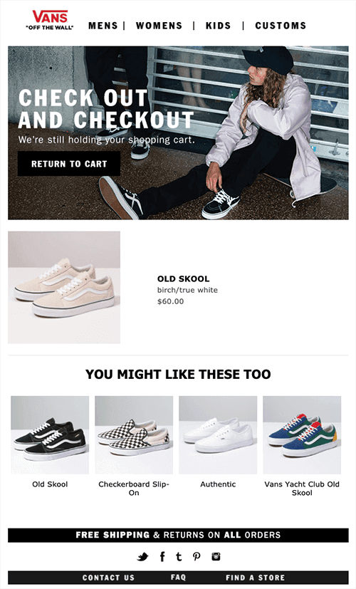
Vans showcases a strong brand identity in its abandoned cart email by featuring a clear image of a pair of Vans Old Skool shoes, instantly recognizable to anyone familiar with the brand.
The text "We're still holding your shopping cart" is a friendly reminder that the customer has items waiting for them in their cart. It avoids feeling pushy and instead uses a casual approach to nudge the customer towards checkout.
Following that is the section, "You Might Like These Too" promoting similar products the customer might be interested in. This is a great way for Vans to potentially upsell and encourage the customer to add more items to their cart.
The email copy also mentions free shipping and returns on all orders. This eliminates a potential barrier to purchase by removing extra costs associated with the order and making it easier for the customer to complete their purchase without wondering about shipping fees.
Casper
This abandoned email from Casper offers a clean and simple design, making it easy to read and visually appealing. Plus, the use of ample white space helps readers focus on the main message.
The heading "Come Back to Bed" is catchy and directly reflects the customer's action of abandoning their cart, and at the same time, playing on the brand's offerings. It gently reminds the readers that they have left something in their cart with the phrase "Looks like you left something behind," without sounding pushy or aggressive.
The "Return to Cart" CTA button is hard to miss, making it easy for the readers to take action. Casper ended the email, with a customer testimonial, adding a layer of social proof to add credibility to the email.

Jessops
Jessops focuses on showcasing the product first and foremost. The email contains a clear image along with its brief description and the price. This puts the product front and center to keep readers’ attention on it.
The email copy is straightforward and uses everyday phrases like, "We noticed you left some items in your shopping basket" and "Don't miss your chance to purchase."
Also, the email highlights in a different text color that the customer qualifies for free next-day delivery. This persuasive technique incentivizes the customer to complete the purchase, especially if they are considering fast delivery options.

Society6
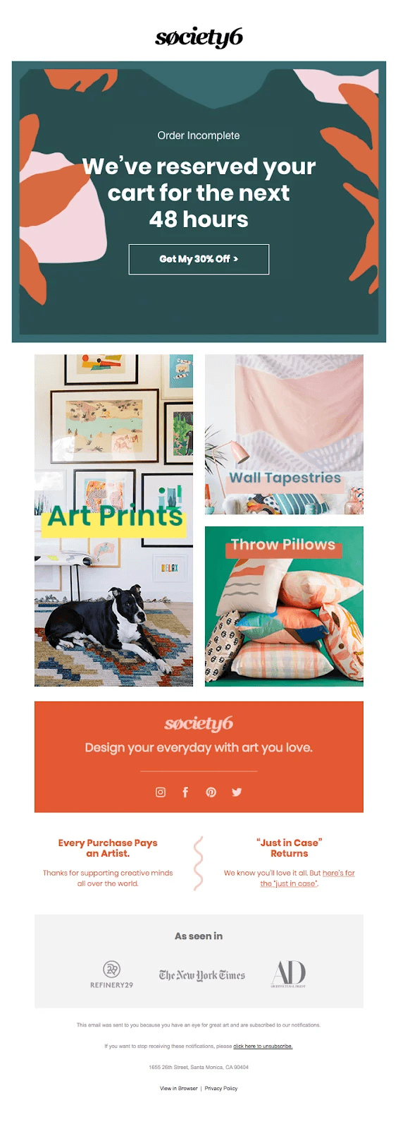
This abandoned cart email from Society6 effectively reinforces brand identity with a clear banner displaying its logo at the top, making it instantly recognizable. From the content standpoint, it starts with a personalized greeting using the customer’s name, making the email feel more tailored and engaging.
The email highlights the abandoned items to remind the user of their intent and creates a sense of urgency by stating, "We've reserved your cart for the next 48 hours." This allows it to encourage the reader to complete her purchase promptly.
Additionally, the email includes a discount offer, providing an incentive to finalize the order. A prominent "Got My 30% Off " CTA convinces the user to take action right now, boosting its overall effectiveness.
Lush
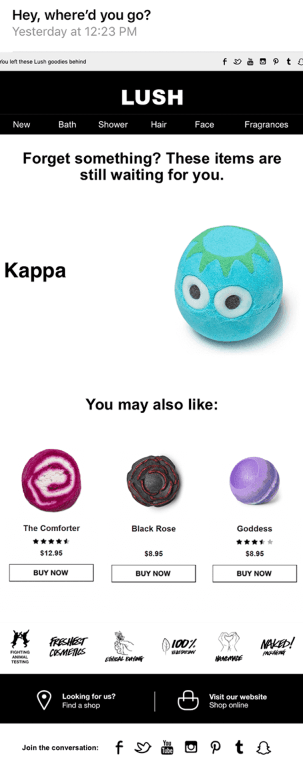
Lush’s abandoned cart email comes with a clear background with visuals of bath bombs and other Lush products that instantly pop up on the screen. This way, Lush reinforces its brand identity and creates an eye-catching email that compels the readers to finish their order.
The email copy is minimalistic, only using text wherever they are necessary. Plus, the everyday tone of the text makes the email more relatable. This lighthearted sales engagement model can be more engaging than a strictly transactional email.
The footer includes Lush’s contact information in case the customer has any questions, ensuring it removes any hurdles that might come across for a smooth customer service experience.
Want to Stop Losing Customers to Abandoned Carts?
Take inspiration from these abandoned cart examples to build your own using Zixflow
Contact SalesRecess
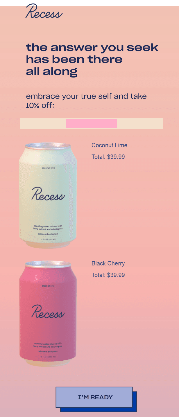
Recess uses a curiosity-inducing subject line, "The answer you seek has been there all along," which is cryptic but keeps things interesting. It piques the customer’s interest and makes them want to open the email to find out what the answer is.
The email quickly dives into the products, starting with a 10% discount, and features clear images of the two Recess sparkling water flavors that were left in the cart: Coconut Lime and Black Cherry, reminding the reader exactly what they were considering purchasing.
Moreover, the email ends with a strong, “I'm Ready" CTA, encouraging readers to take action and complete their purchase.
Overall, the email has a clean design with a light-colored background and easily visible text, making it easy to read and navigate.
Ugmonk
Ugmonk has adopted a much more personalized approach, where the abandoned cart email is sent as a tailored message to the customer from the Founder of the company rather than someone in the sales team.
It features nothing but plain text, with a clear structure to it. It starts by reminding the customer about their cart, goes into answering any questions they might have, highlights its passion for its products, and asks the customer to reply to this email if they have any queries.
The CTAs are embedded within the content instead of a button which is usually the case for these types of emails. The important text is bolded and the links are clearly visible due to a white background with black/blue text, thereby making the email simple, yet effective.

The North Face
The North Face, in its abandoned cart email, uses a compelling header, such as, "You're Almost There" to immediately grab attention, creating a sense of progress and achievement to motivate its prospects to complete the purchase.
The follow-up text, "It’s in your cart. Just one last push and it’s yours," is, again, straightforward and encouraging, further bolstering the headline and making the readers take instant action.
Lastly, the visual of a climber reaching for the next hold is not just picturesque but also metaphorically reinforces the message of being close to the goal. It resonates well with the adventurous spirit of the brand, reminding you why you chose its product in the first place in a subtle way.

Use these abandoned cart email examples to craft compelling emails and skyrocket your conversion rate
Well, there you have it. These are the 17 best abandoned cart email examples to give you inspiration and allow you to win back your lost deals.
When crafting an email for your business, make sure it matches your brand/offerings, is tailored to your prospect, and contains relevant features to compel your audience to take action.
However, creating an abandoned cart email is just one part, you also need marketing software to send these emails to your prospects in a timely manner to ensure you don’t lose them forever. That’s why I recommend using Zixflow, a multi-channel marketing platform to engage your prospects at the right time.
Zixflow’s email marketing capabilities allow you to create engaging emails using either the Text Editor or building a custom layout with its Drag-and-Drop Template builder.
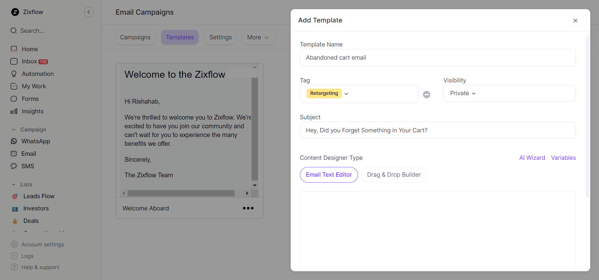
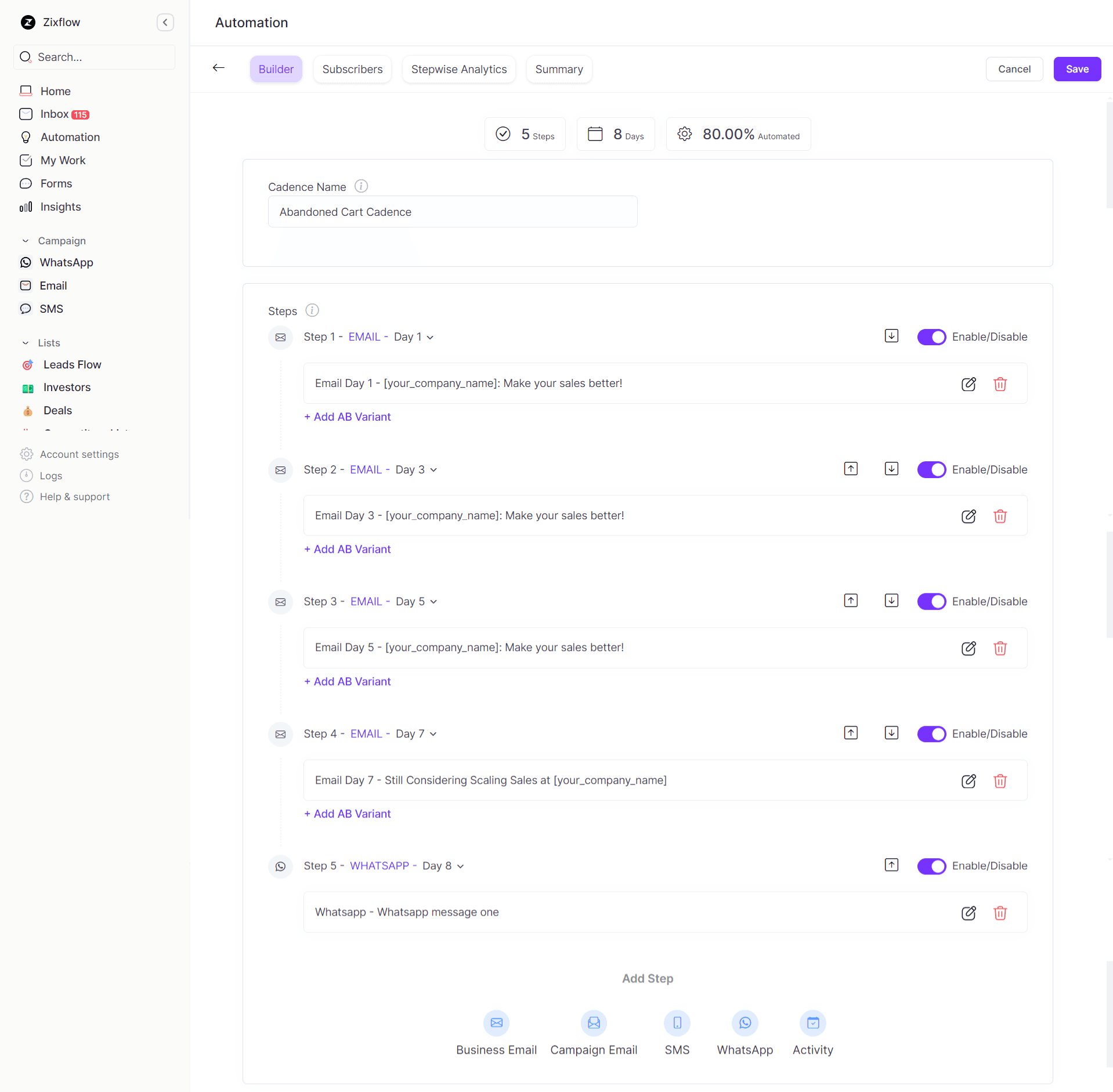
Additionally, you can automate your abandoned cart emails to be sent on a specific day or time using sales cadences. Using these cadences, you can keep following up with prospects with predefined emails without having to monitor them manually.
Also, you can set up a cadence break-up rule so that if a prospect ends up taking action on your abandoned cart emails, they will not receive the next emails that are waiting to be sent.
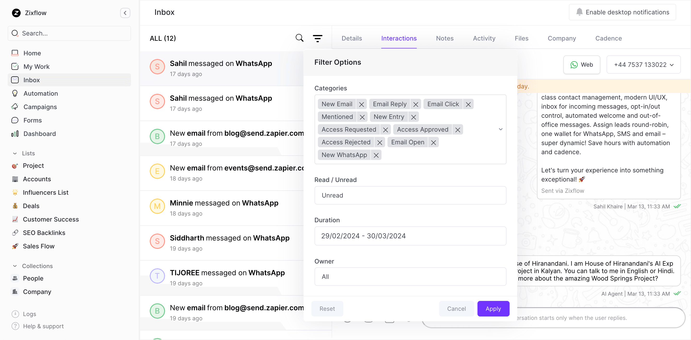
On top of that, if your prospects reply to your emails, you can access these responses from a centralized inbox, making it easy for your sales or support staff to handle them promptly. This way, they don’t have to switch between multiple tabs to find new emails and efficiently resolve customer issues.
Still need convincing? Why not try out the platform yourself? Get started with a 7-day free trial of Zixflow and leverage its outstanding marketing functionalities to drive more conversions for your business.
Sahil Tyagi
I'm a passionate content writer and SEO enthusiast who enjoys turning ideas into helpful articles. When I'm not busy with content, you'll find me enjoying sports or reading about growth strategies.
