19 Cool Welcome Email Examples for Ecommerce from Real Brands

Table of Contents
Here’s a question for you, if you sign into an e-commerce store, would you still remember doing so after a week? And your customers are no different.
Without a well-thought-out welcome email, your customers will forget that you even exist, let alone buy something from you. Welcome emails are crucial for not only introducing your brand to your customers but also staying relevant in their minds.
In fact, welcome emails in general, get up to 320% more revenue for each email than the marketing ones. This goes to show that welcome emails are a critical part of sales engagement.
Having said that, before you design a welcome email for your e-commerce business, let’s look at the 19 cool welcome email examples from actual brands and how they use these emails to encourage their audience to take action.
19 awesome welcome email examples
Welcome emails serve two purposes: thanking new subscribers for signing up for your e-commerce platform and bringing them up to speed with your offerings. That being said, here are some of the welcome email examples from real businesses to give you insight into crafting your own.
Zixflow
Although Zixflow is not a purely e-commerce platform, you can still take inspiration from its welcome email. In this hello email, Zixflow incorporated a quick overview video to update new customers about the platform quickly.
Following that, the email delves into the features of the platform along with relevant visuals to grab users’ attention and briefly explains how they can be beneficial to you.
Another thing to notice here is that after every section of the text, there is a clear CTA to compel readers to take action immediately if they want to check out a feature.
Lastly, at the end of the welcome email, Zixflow in a crisp manner, mentions that if you have any questions, you can reach out to us via booking a time slot or emailing our support team.

Huckberry
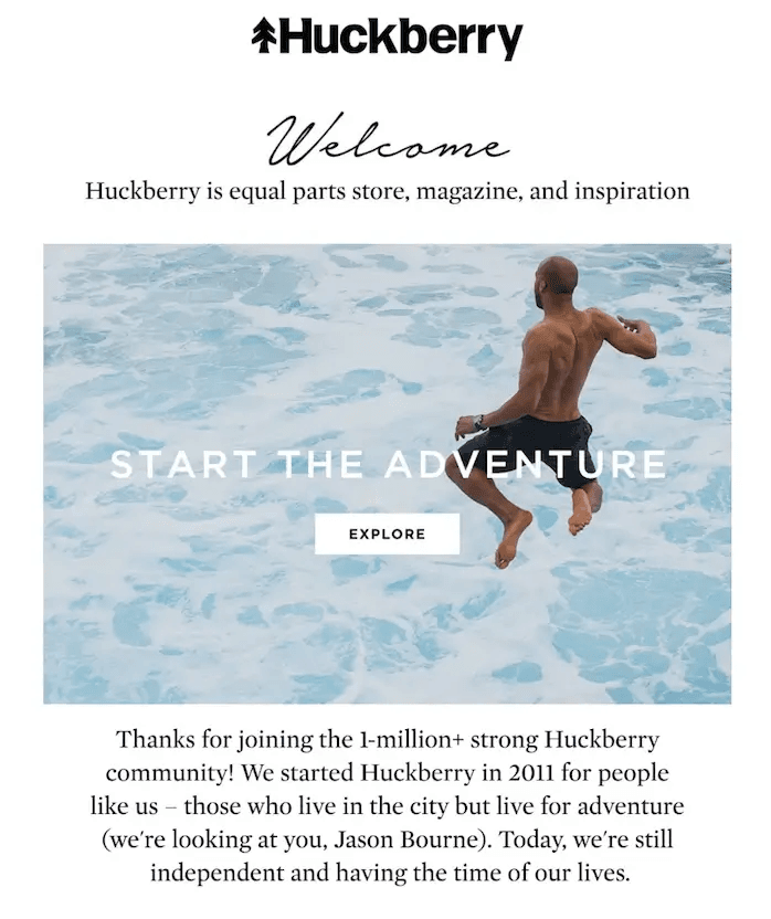
Huckberry, a men’s clothing and accessories brand, in its welcome email, inspires a sense of adventure with its opening image and email content thanking subscribers to be a part of its 1M+ community. After that, the copy talks briefly about the company and highlights its USP of finding adventure in the middle of everyday life.
Furthermore, the tone of content makes it easy for subscribers to relate to the brand, and the mention of Jason Bourne, again, ignites the feeling of chasing an adventure in a friendly manner. Pair that with its hard-to-miss CTA make it a short and sweet welcome email that truly focuses on engaging potential customers.
Airbnb
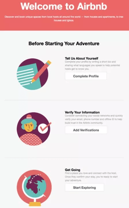
Airbnb, a renowned travel and accommodation company, sends a checklist of tasks to their first-time subscribers, asking them to take action right from the start. The light-colored background ensures that the readers focus on the content and makes them focus on the CTAs.
One thing that stands out from other welcome emails is that Airbnb is the structure. Segmenting each step into smaller sections is an excellent method to keep the readers’ attention on a particular action and not burden them with too many tasks
Birchbox
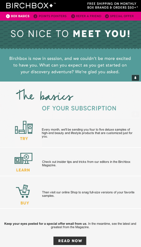
In its welcome email, Birchbox, offering beauty-related products, starts its email with a free shipping offer, already captivating readers’ attention and encouraging them to make a purchase.
After that, the email continues with a greeting and a brief text as to what the subscriber should expect next from Birchbox. In the bullet points-type structure, Birchbox highlighted the “basics” of the subscription, ensuring subscribers are aware of what is to come.
Finally, at the end, the bold text and the CTA, “Read Now” are clearly visible, making sure the recipients don’t gloss over it. The email is designed with a customer-centric selling approach and is straightforward on what you can expect from the brand.
Luminary
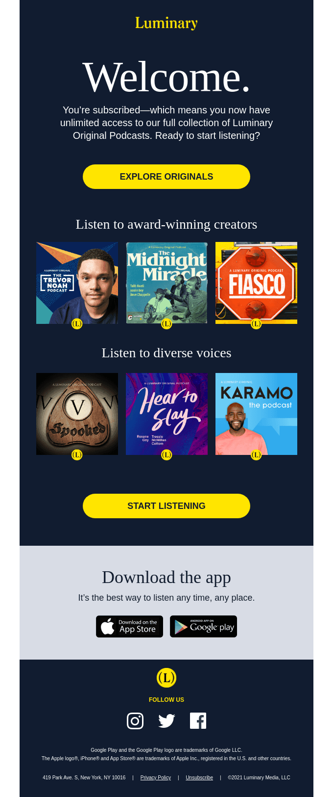
Luminary is a subscription-based podcast network that offers engaging and entertaining content across numerous genres. In its welcome email, Luminary begins with a big welcome followed by a crisp description that you can access a complete library of Luminary’s Original Podcasts.
The CTA after that compels readers to explore the collections and begin listening to them. In case readers don’t have something in mind, Luminary offers suggestions from its award-winning creators along with some varied recommendations from multiple genres.
Want to send engaging welcome emails like Luminary
Get started with Zixflow’s email marketing platform to design tailored emails to best fit your business
Book a DemoFitbit
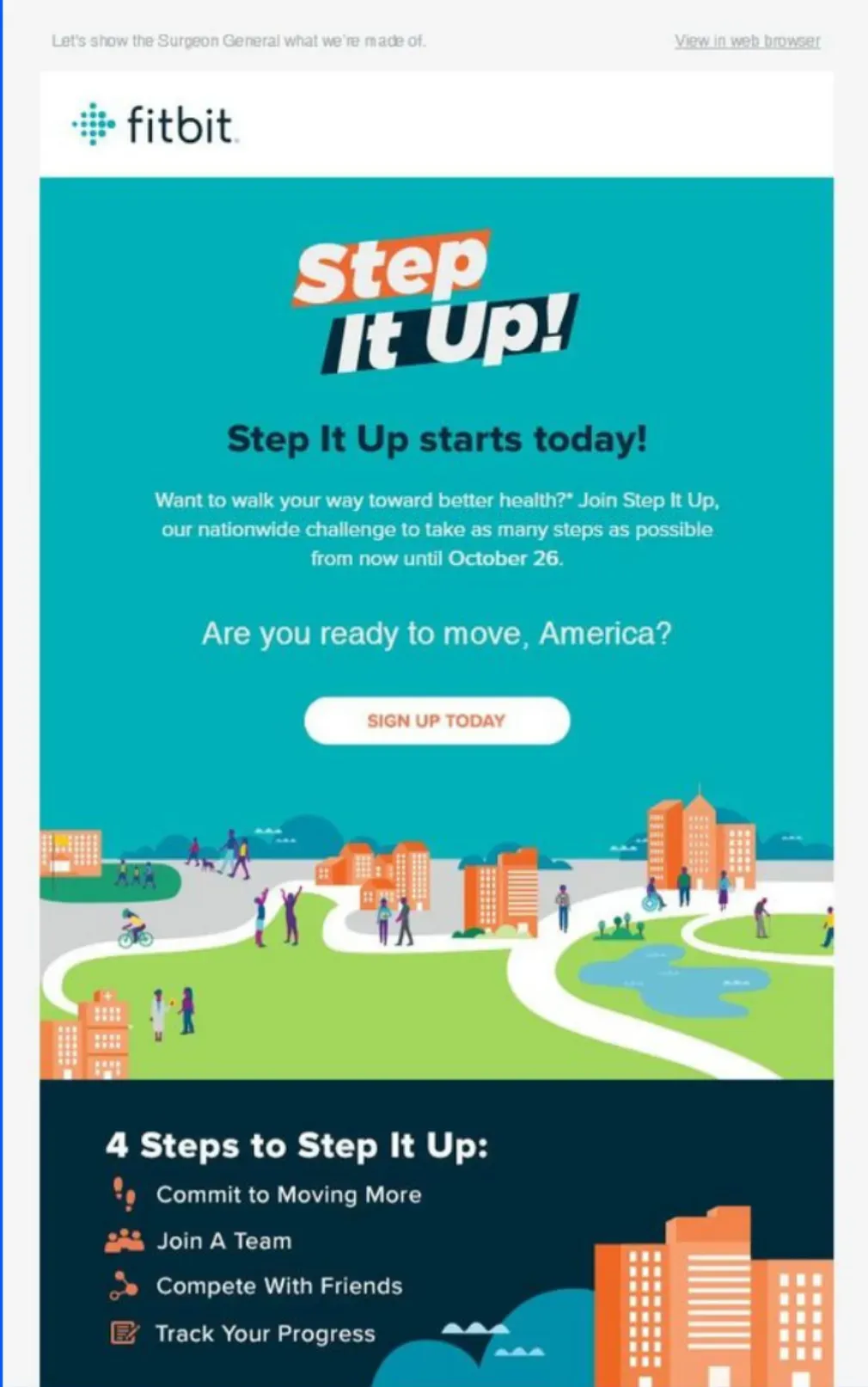
Fitbit, in its Step It Up email, clearly lets its readers know what to expect along with a convincing CTA to take action right now.
At the bottom of the email, Fitbit provides a 4-step guide to take as many steps as possible and use their products to track their progress. Overall, the email is clean and the infographic vibe boosts engagement among the audience.
John Lewis
John Lewis welcomes its subscribers with a simplistic welcome email and instantly grabs their attention with a hard-to-miss CTA that pops out clearly on the white background.
In addition to that, the email goes on to describe what the future roadmap is in a step-by-step manner, followed by a “Start shopping” CTA to convince readers to take action and visit its website. Also, the modern interior background of the email silently promotes the brand’s offerings without having to do so in the copy.
![__wf_reserved_inherit]https://uploads-ssl.webflow.com/6511240890b712e01083f2a8/666adb81db9175eb9fe8c9ef_Welcome%20email%20example%20from%20John%20Lewis.png)
Podia
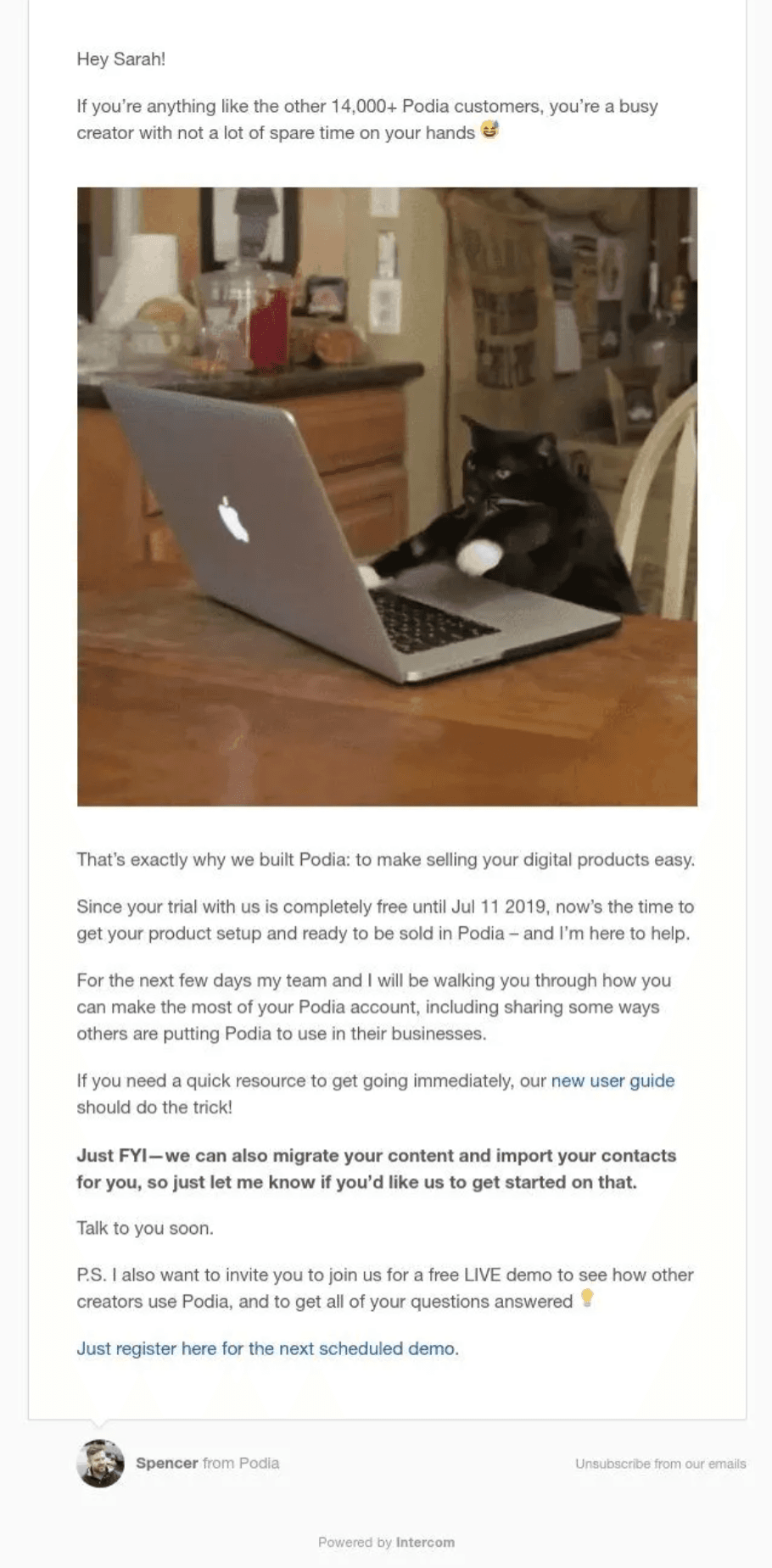
Podia’s onboarding email is full of engaging elements, such as entertaining GIFs and emojis. The email starts with a one-liner social proof, mentioning that you are a part of “14,000+ customers." After that, to boost sales via customer engagement, it uses a humorous GIF to stop you from clicking off the email.
Then, it delves into the history of the company and what you can expect from them in the coming days, ending it on a bold note that you can migrate your website and import your contacts from other platforms to Podia. This bold text attracts attention and highlights a USP from the company.
Lastly, the email ends with a CTA, asking you to book a demo. Plus, the welcome email is sent from the profile of Spencer, adding a human touch to the email and making it look different from an automated one.
Duolingo
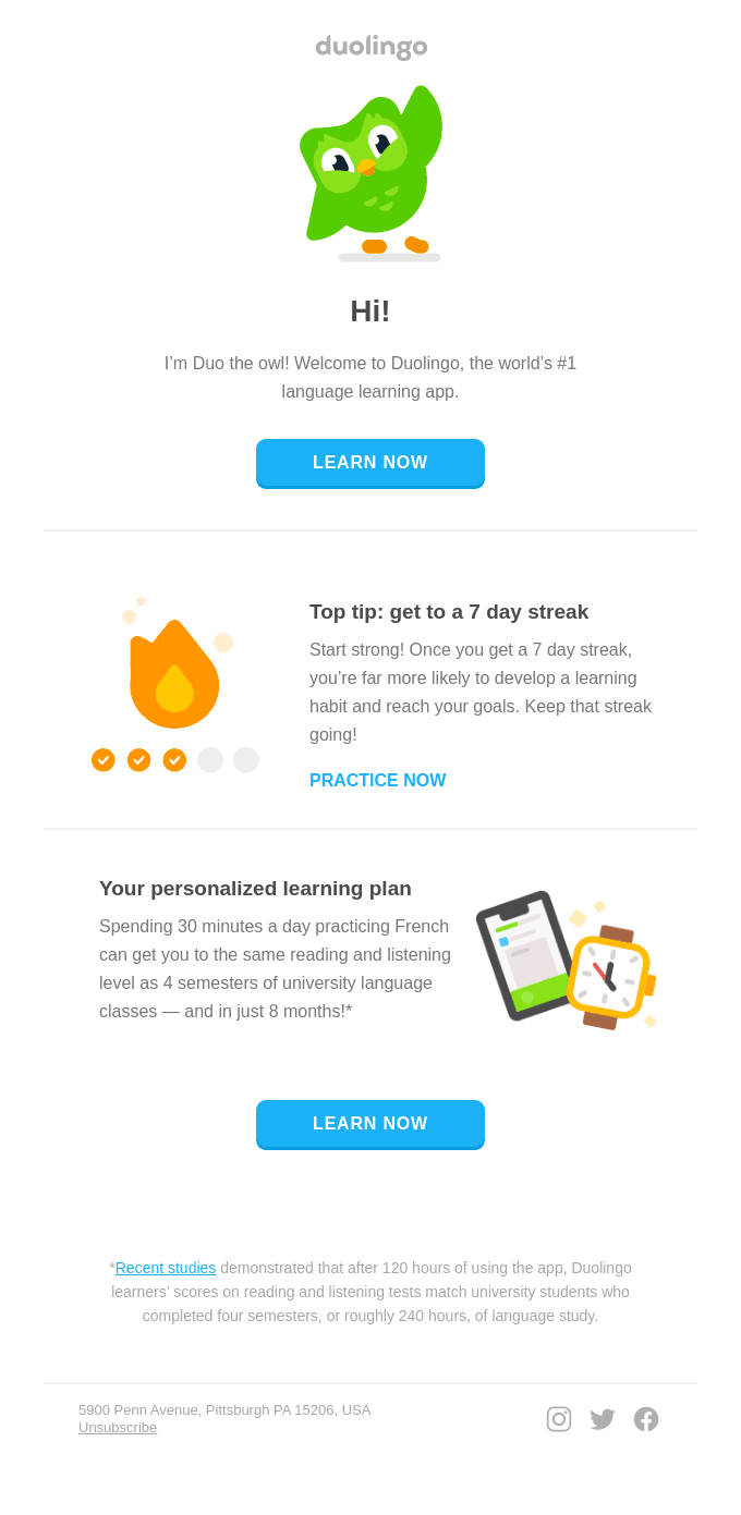
The welcome email from Duolingo showcases various email marketing strategies that make it both engaging and informative for new users. The email begins with a friendly greeting from Duo the Owl, immediately establishing a warm and approachable tone.
The email is well-structured, highlighting a clear CTA button prominently displayed, encouraging users to begin their language learning journey. Additionally, it includes a motivational tip about maintaining a seven-day streak to foster a consistent learning habit, accompanied by an encouraging CTA.
The email also highlights the brand’s statistics, stating that just 30 minutes of daily practice can equate to four semesters of university language courses, supported by a reference to recent studies. This way, Duolingo not only emphasizes its value but also sets realistic goals for its users.
Curology
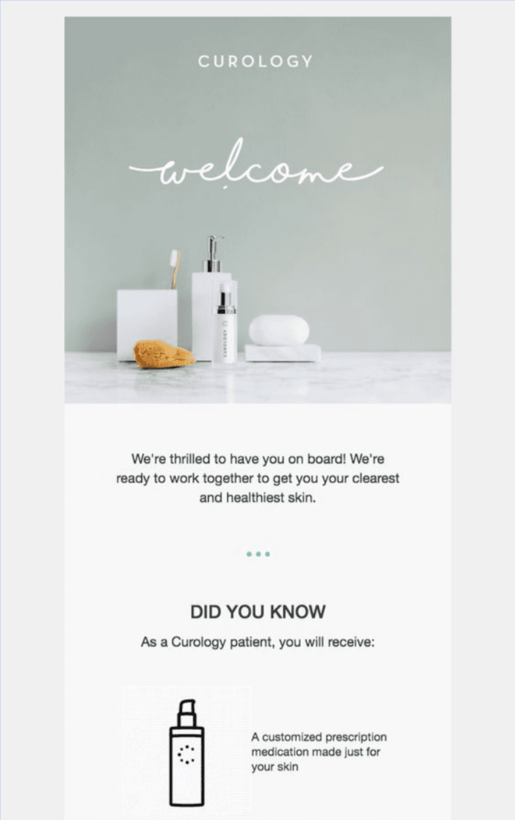
Curology’s welcome email is a prime example of effective communication that engages new subscribers and sets clear expectations. The email opens with a visually appealing design featuring a clean, minimalist aesthetic that reflects the brand's focus on simplicity and quality skincare.
The warm welcome message immediately establishes a sense of partnership and personal care. This friendly tone helps the company build rapport with its customers right from the start.
The "Did You Know" section informs the readers that they will receive a tailored prescription for their skin, reinforcing the brand’s commitment to individualized care. The use of simple icons alongside its white background quickly conveys the key benefits without overwhelming the reader with too much text.
Looking for a marketing platform to send minimalistic emails similar to Curology?
Check out Zixflow, a modern email marketing platform that includes an email template editor to give you full freedom to craft your emails the way you want
Try it OutSquarespace
The welcome email from Squarespace is a great example of clarity and user-friendliness, guiding new subscribers through the process of creating a website in just three steps.
The email's title, "Create your website in three steps," sets clear expectations, making the task seem achievable. It includes a visible CTA button, positioned prominently to encourage immediate action from the user.
After that, the email breaks down the process into three actionable steps, starting from learning to creating to styling, each accompanied by short descriptions and relevant visuals, to give readers an idea of each phase.

Beam
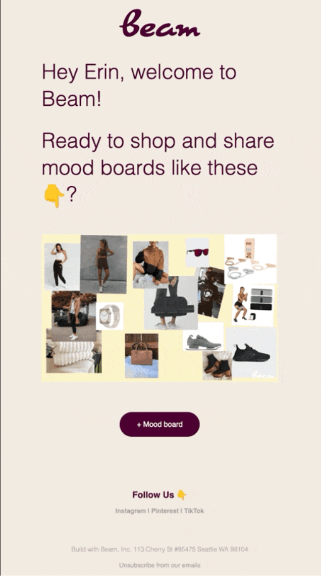
Beam, in its welcome email, gets straight to the point by giving an example of its mood boards in a line. The email copy is followed by a collage of images giving the subscribers a firsthand look into what they can do with Beam.
A neatly placed CTA at the end and the follow us text below conclude the email in minimal words, making the entire email a one-minute read.
Casper
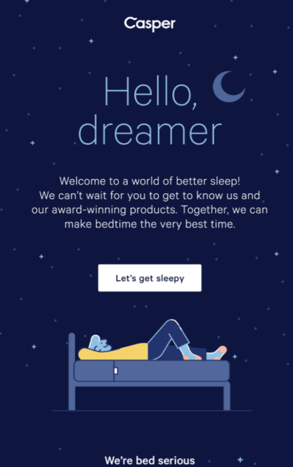
Casper, a bedding and mattress brand, uses a custom background that signifies a night sky to showcase its offerings. In its welcome email, the company starts with a big hello text and uses the word “dreamer” rather than the name of the subscriber.
After that, the email copy highlights Casper’s USP of “better sleep”. Following that is a brief description encouraging the readers to check out its “award-winning products” and finally the CTA of “Let’s get sleepy” directs subscribers to the website where they can browse through their options.
West Elm
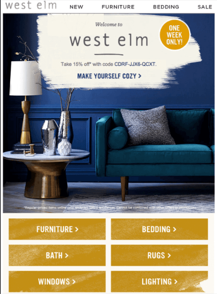
West Elm employs a sales psychology tactic and opens its welcome email by jumping straight into the action. Providing a discount code to take 15% off the next purchase, is urging the subscribers to take action instantly and creating a sense of urgency.
Below the discount offer, comes a beautiful image of some of the offerings of West Elm followed by the categories of products it offers. By clicking a relevant category, you will be directed to the corresponding landing page to browse through their catalog.
Glossier
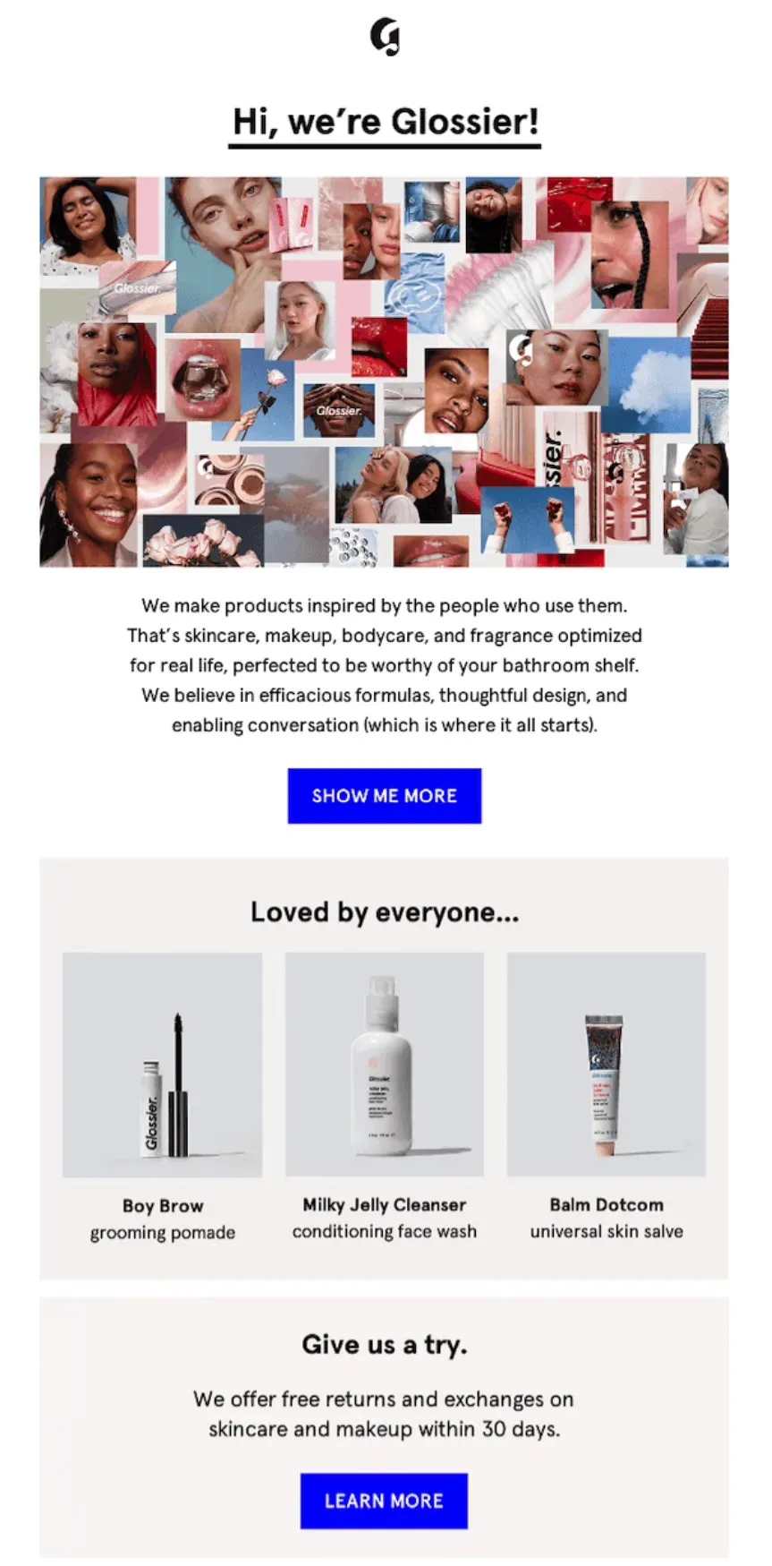
The email starts with a friendly greeting and a collage of high-quality images of customers using Glossier’s products. After that collage, there is a brief introduction about the brand, explaining its philosophy and what sets it apart, helping it build a relationship with new subscribers.
Then, there are prominent CTAs that guide the reader on what to do next, making the email interactive and encouraging actions.
There is also a product showcase at the end of the email with clear images of the products along with a concise description. This lets the subscribers learn more about the products and their benefits quickly.
All-in-all, the email uses a clean and minimalistic design with a cohesive color scheme, primarily white with accents of blue and pink, making it align well with Glossier’s brand aesthetic.
Send eye-catching emails that not only look good but perform great as well
Zixflow allows you to create tailor-made welcome emails with its AI Wizard, freeing up your time so you can focus on growing your brand
Get StartedBeardbrand
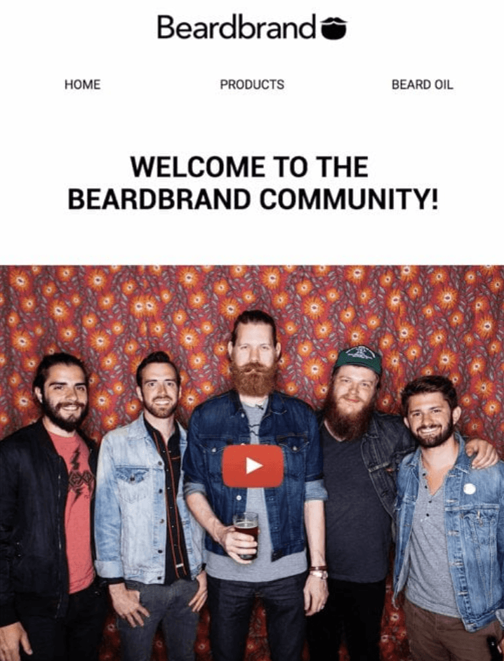
Beardbrand, as the name suggests, offers grooming products for men. In its welcome email, the company has adopted a straightforward approach, and instead of using words, it simply provided a video to showcase its product.
After watching the video, the subscribers will have all the necessary information about Breadbrand and will be ready to make a purchase.
Evernote
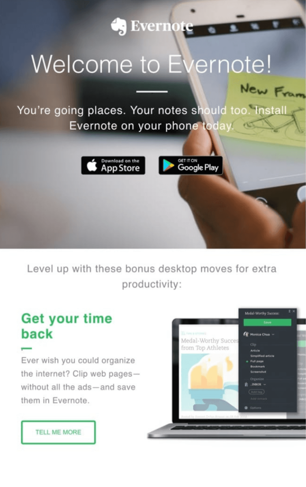
Evernote does a great job of engaging subscribers by telling them directly to download its mobile app to access their notes on the go. However, in case you don’t want to use Evernote on the phone, the email then goes into “bonus desktop moves” to boost your productivity on the PC.
The email content is designed in a landing page format, where content is accompanied by an image. These types of emails give you a feeling of browsing through a website rather than reading an email, further increasing engagement levels.
Dims
The welcome email from Dims is minimalist and eye-catching. The brand has utilized the concept of “let your products do the talking” and used very little content in the email.
In the email copy, Dims just thanked the subscribers for joining and told them what they could expect from the emails. There is also a well-placed CTA right below the content, enabling readers to check out its furniture or home decorating products.

Allbirds
Allbirds, in its welcome email, used numerous images to keep its subscribers interested in its offerings and make them stay for a long time. In the middle of the visually appealing graphics, there are also different kinds of drawings to put the brand in the limelight from the get-go.
The email is loaded with well-spaced call-to-actions to encourage readers to click on at least one of them and take a look at the products on the website, increasing the likelihood of getting a conversion.

Drive engagement and grab the attention of new subscribers with these e-commerce welcome emails
By now, you must have gotten a solid idea of various types of e-commerce welcome emails you can send to boost engagement and make your subscribers interact with your business.
These emails serve as a vital contact point between you and your potential customers, allowing you to showcase your brand in a positive way, highlight your USPs, and thank them for signing up with you.
Although you can send welcome emails using a normal service provider, you need an email marketing platform if you need to design custom emails or send them at scale.
Zixflow is one of those platforms that lets you craft tailored welcome emails for your e-commerce business and send bulk emails without any wait time. It’s very easy to use Zixflow for your email outreach. For example, fill in your business details and verify your domain.
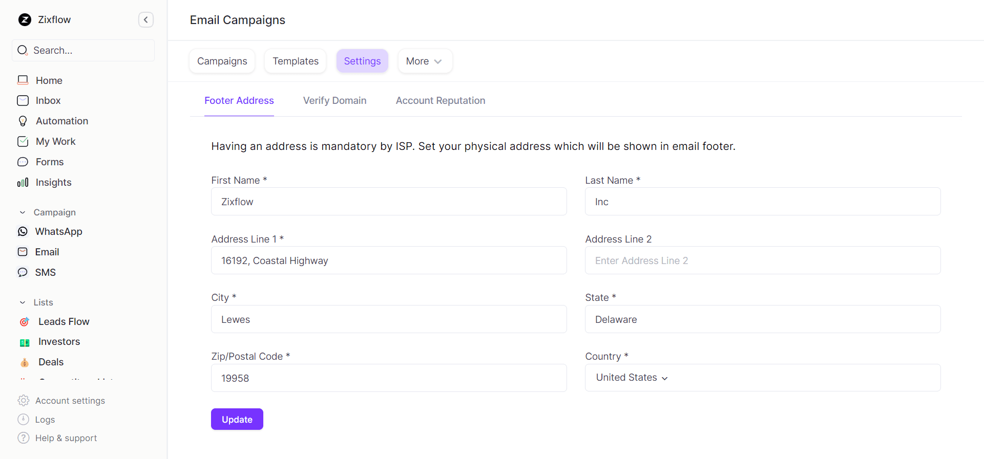
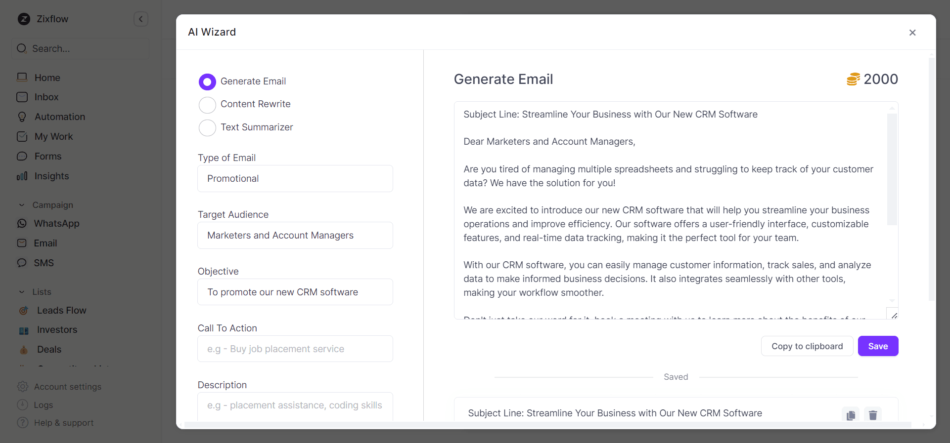
Once your domain is verified, create email templates using our Text-based or Drag-and-Drop Template Editor. If you are having trouble writing email copies, you can also use our AI Wizard to generate email content in a few seconds.
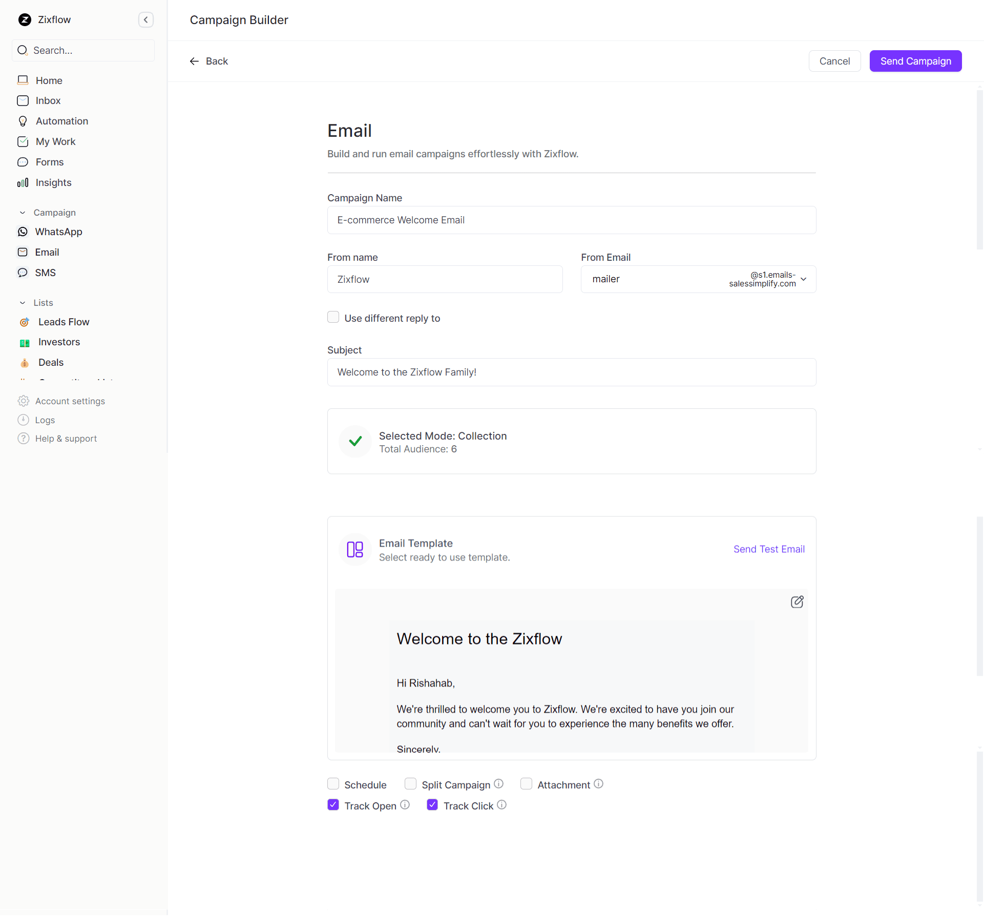
Now, you are ready to send your welcome emails. Set up a campaign by entering a name, selecting a domain, filling in the subject line, adding an audience, and choosing a template. Once you have filled in all the necessary information, click Send Campaign, and that’s it.
I understand that all this seems challenging, but let me tell you that is not the case. Don’t believe me? Test it out yourself! Create a free account right now and embark on your e-commerce journey in style.
Sahil Tyagi
I'm a passionate content writer and SEO enthusiast who enjoys turning ideas into helpful articles. When I'm not busy with content, you'll find me enjoying sports or reading about growth strategies.
